Bee Line Support Inc.
THE CONCEPT

BEE LINE SUPPORT is unlike any janitorial company you’ve ever met.
They are a WOMAN-OWNED, deep cleaning corporation that has set themselves apart as the leading medical-grade cleaning company in the U.S. This is due, in no small part, to their ability to think three steps ahead of their competition (A.K.A. outdated janitorial firms). This is why Bee Line put such a high stake in our marketing and digital presence (a commonly overlooked asset within the janitorial realm).
When we began to rebrand their image together, it was clear that they understood (better than anyone) how crucial first impressions can be to landing new clients. They were ready to take the leap and create a digital identity that matched their professional reputation.
THE PROBLEM
As we contemplated the best identity for their new brand, we needed to be sure that the site reflected their company’s key values, which have always been centered around people, leadership, and expert medical-grade training.
Additionally, the brand needed to appeal to its ideal customers and potential new hires, who would enjoy the new visual direction, including colors, fonts, icons, photography, and key messaging.
Creating a digital identity helps you to strengthen your brand, connect with the target audience, and leave a lasting impact on anyone and everyone that gets to interact with the new site.
So, before we began developing, we first went back to the drawing board.
THE SOLUTION
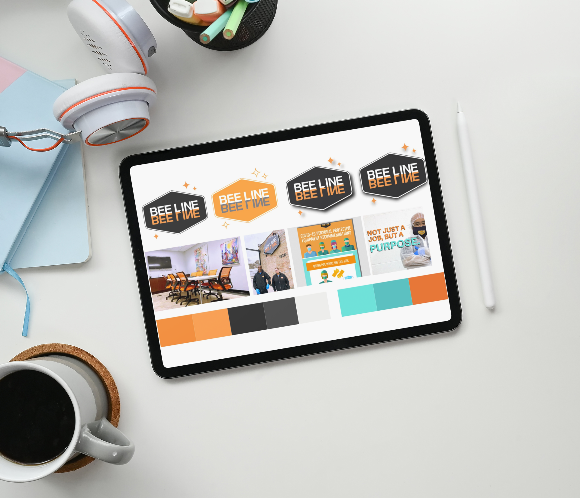
First Step: Intentional & Authentic Branding
The new brand had to capture the essence of what it means to work for and work with Bee Line. This included:
Highlighting their brand personality:
Modern
Team-Oriented
Urban
Innovative
Bold
Clean (pun intended)
Showcasing many, many photographs and videos of their people and their outstanding culture
Emphasizing their values, mission, story, and value proposition
Using bright colors to capture the vibrancy of Bee Line, and clean space and backgrounds to emphasize only the most important elements of the brand
We all agreed, that no matter what we designed or how we chose to build the site, the number one focus was on emphasizing people, personality, and their one-of-a-kind brand.
Once these elements were decided and agreed upon, it was website time!
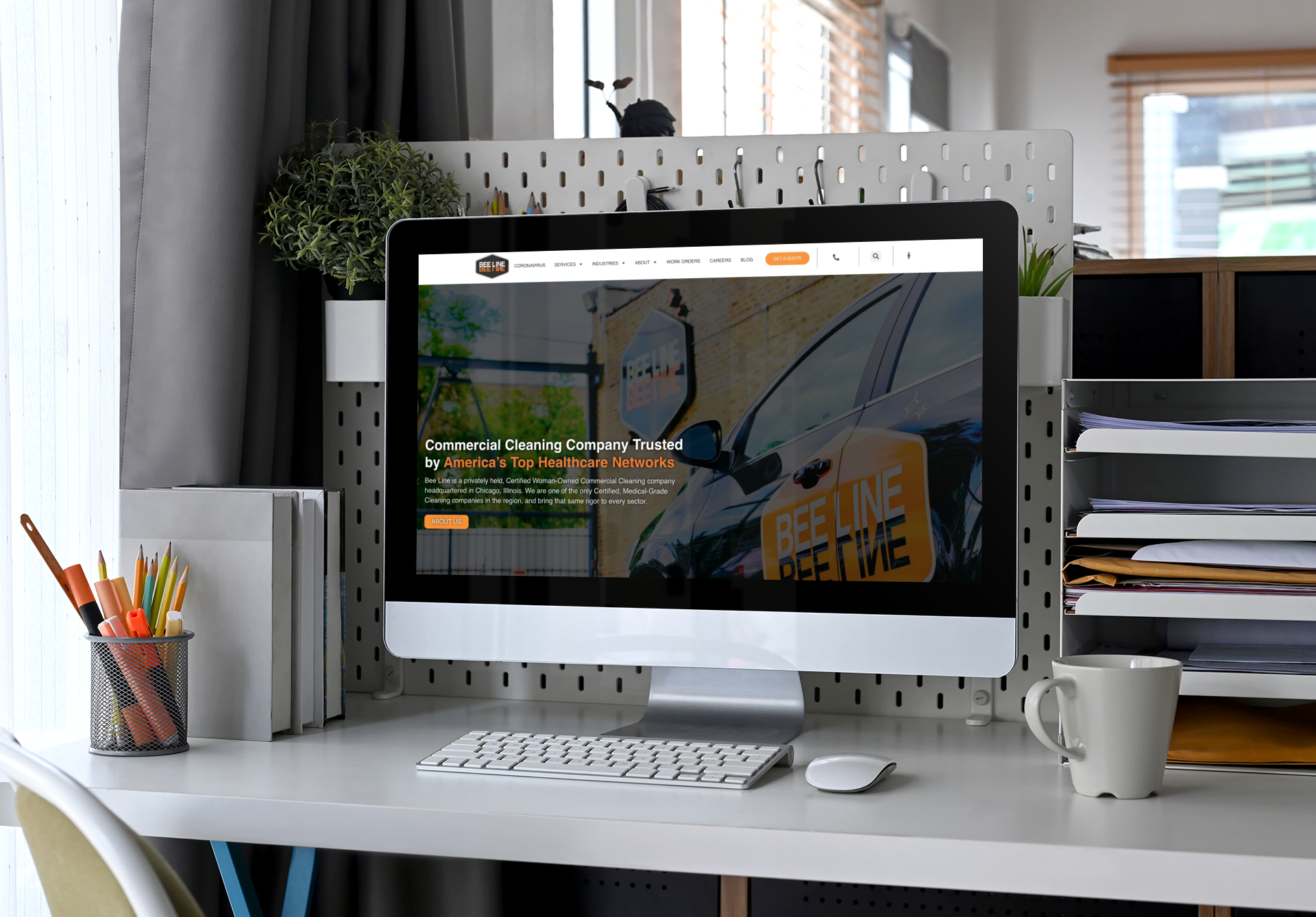
Second Step: Website Re-Design
Improving the User Experience:

If pictures can speak a thousand words, this before and after photo speaks volumes.
The previous site was originally branded to fit the motto “The Cutting Edge of Clean”, and was stylized in a black and white, urban aesthetic that played up the “edginess” of the company. At the time this image served its purpose dutifully and gave a nice, high-level preview of how they tackled messes.
Once we fully audited the site for the brand revamp, we recognized that although the site was catchy, we were barely scratching the surface. The previous site failed to tell a story, highlight their culture, or efficiently lead visitors to the appropriate page - the conversion page!
In the rebuild, we made sure to:
Showcase their incredible talent in imagery and section across the site
Boldly highlight just how different we are as a cleaning company (adding facts and images reflecting modernity, diversity, training, and more)
Delve into all of the different services AND industries we work with
Clearly guide the viewer through an experience – learn about us, learn how we can help you, and then easily request a quote
We didn’t want any confusion as clients worked their way through the site, so we laid out a site map that was easy to navigate. We optimized for white space, bold headings, and clear copy that tells viewers (clients and job seekers alike) only the information they need to make a decision.
Improving Mobile Responsiveness:
We also recognized that the website was not mobile-friendly, and took way too long (up to seven seconds!) to load. That is the fastest route to having a new audience member leave the site. In the rebuild, we built the site on a new server platform, WordPress, and made sure that every element we added to the site was mobile-friendly, fast-loading, and SEO optimized.
OUR APPROACH
WEBSITE RE-DESIGN
In our approach to rebranding and revitalizing Bee Line's online presence, we embarked on a two-step journey focused on intentional and authentic branding followed by a comprehensive website redesign. Initially, we aimed to encapsulate Bee Line's essence—modern, team-oriented, urban, innovative, bold, and uniquely clean—through vibrant branding that emphasizes their distinctive culture, values, and mission, utilizing bright colors, ample white space, and an abundance of photographs and videos to spotlight their people and culture. The consensus was clear: our design and development efforts were to prioritize the representation of their unique personality and brand above all.
Transitioning to the website redesign, we enhanced the user experience by overhauling the visual and navigational aspects to more effectively tell Bee Line's story, showcase their diverse services and industries, and simplify the user journey to the conversion page. Recognizing the limitations of the previous site, including its lack of mobile responsiveness and slow loading times, we opted for a platform shift to WordPress, ensuring the new site was not only visually engaging but also mobile-friendly, fast-loading, and SEO optimized. This meticulous rebuild aimed to guide visitors smoothly from introduction to action, firmly establishing Bee Line as a leader in the modern, diverse, and innovative cleaning industry.